
Key Things to Look For in a Professional Logo Design
When business owners start thinking about a new logo, they often jump straight to the aesthetics: colors, fonts, and shapes. But a professional logo design goes much deeper than just looking pretty on a business card.
A logo is the face of your brand, and evaluating it requires looking beneath the surface. If you want to know whether a logo design is truly professional and built to last, here are the key elements you need to look for.
The Four Pillars of a Professional Logo
Before we even discuss aesthetics, a logo has to function on a strategic level. A truly professional identity rests on four non-negotiable pillars:
It Supports Your Brand Story: Every business has a unique story—how it started, the customers it serves, and the unique problems it solves. A strong brand story is the foundation of any good logo. If the logo doesn't reflect the heartbeat of why your business exists, it falls flat.
It Speaks with the Right Tone of Voice: Your logo needs to speak with the exact same tone as your product or service. Whether your business is highly corporate, whimsical, or deeply serious, the colors, fonts, textures, and patterns must all work together to support that specific tone of voice.
It Identifies What You Do: A good logo helps your target audience immediately understand your industry. To a certain extent, people should be able to glance at your identity and know if you are a restaurant, a health and beauty brand, or a B2B service.
It Differentiates You from the Competition: While your logo needs to identify your industry, it must simultaneously set you apart within that industry. A professional design helps a business stand out in a crowded market and clearly communicates how they uniquely serve their clients.
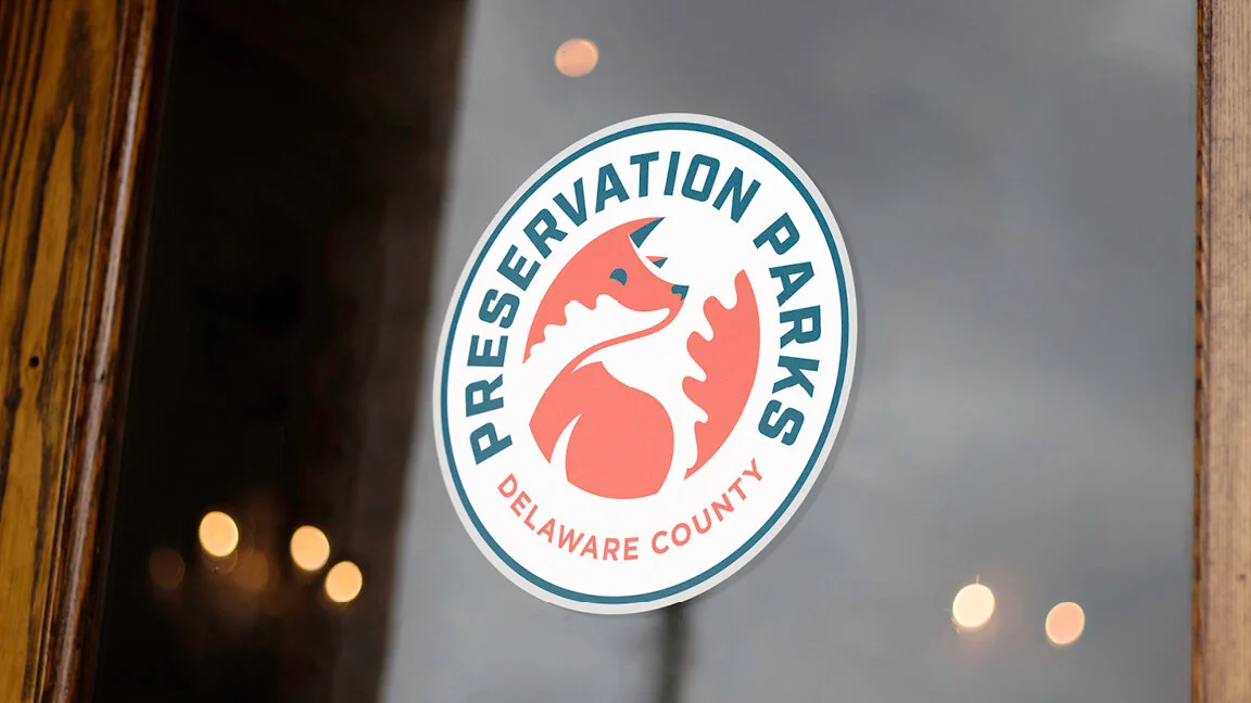
Seeing It In Action: Preservation Parks of Delaware County
To see how these four pillars work together, let's look at a project we completed for Preservation Parks of Delaware County.
Unlike other metro parks in the area that feature athletic facilities or party pavilions, Preservation Parks has a unique story. They are truly about preserving nature—creating quiet places to take a walk with family and observe unique flora and fauna.
Identification & Story: We needed people to know this is a place for a unique, nature-focused experience. We leaned into an outdoorsy, adventurous vibe by designing a logo that looks like a classic Boy Scout merit badge.
Differentiation & Tone: If you look at most park logos, you see a heavy reliance on trees, leaves, and water, usually in blues and greens. The problem? Those colors completely disappear on roadside signs when you are driving through rural areas. To make a statement and stand out, we differentiated the brand by using bright, highly visible colors and introducing a fox mascot. It solved a practical visibility problem while perfectly capturing the spirit of the parks.
Avoiding the "Personal Preference" Trap
When reviewing logo concepts, the biggest trap I see business owners fall into is focusing too much on their own personal identity rather than the identity of the brand.
It is vital for a founder to recognize that the brand must stand on its own. It is not about the owner's favorite colors or their personal hobbies. A brand must tell its own story and be fiercely targeted toward the correct demographic.
Similarly, many companies try to chase trends or copy what everyone else in their space is doing. If you want to succeed, your brand has to stand out on the shelf, not blend into the background.
The Real Mark of a Professional: The Discovery Process
Many people think the "technical" side of a logo is just about file formats or scalability. But the true practical element you should look for in a professional design is the discovery process behind it.
You should only work with a designer who is willing to spend the time to really get to know you. Expect them to visit your location, meet with your employees, and talk to your best customers.
Often, I take clients on "field trip" meetings. We will go to retail stores that sell similar products and go shopping together for the day. I learn so much from watching clients interact with packaging—hearing their preferences, feeling the textures, and observing how copy and call-outs are presented. Many times, business owners don't have the vocabulary to articulate exactly what they want. These real-world experiences bridge that gap and ensure the final design aligns perfectly with their goals.
The Ultimate Test of Success
So, once the discovery is done, the design is finalized, and the new logo is out in the wild, how do you know the investment actually worked?
The ultimate test of a successful brand identity is not just that someone tries your product for the first time because it caught their eye. It’s that they continue to come back and purchase it again.
A truly professional logo design doesn't just create a brand—it creates a following. When your story, tone, identification, and differentiation all align seamlessly, you move beyond just having customers. You create die-hard fans.