
GRAPHIC DESIGN & ILLUSTRATION

Many of our clients come to us with an existing logo and identity, but are ready for something new.
Here are some of the redesigns that got them from there to here.
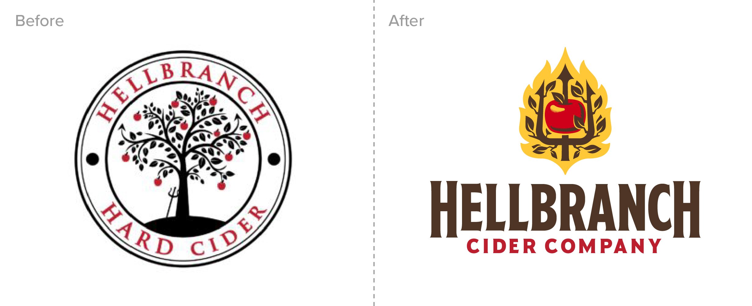
Hellbranch Cider Company
“It was a pleasure working with Jeremy. He was very patient and took lots of time to listen to my wants, needs, and preferences. He really got to understand my business and the plan for its future. I was blown away when I got the first look at the designs he created for me. I will definitely refer him to others and use his services again in the future.”
James Wilson, Owner
Slagle Design is excited to share the new brand identity and packaging we completed for Hellbranch Cider Company. James Wilson started Hellbranch as a hobby while working for a national insurance company. As with many of our clients, James’ hobby became an obsession, then a side-hustle, and eventually his full-time job. We love helping entrepreneurs bring their passion to life!
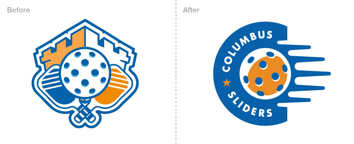
Columbus Sliders Pickleball
“Jeremy was able to transform our concepts into visuals in a way that cultivated our community growth. We love seeing our new logos in the community and engaging everywhere.”
Fernando Esquivel, Director of Operations,
The Columbus Sliders
Columbus’ Premier Level Major League Pickleball team, The Columbus Sliders, has a new look for their 2025 season as they host their first hometown match and tournament since their inaugural season.
The previous logo was closely integrated with their founding Sponsor, White Castle’s logo. The new logo allows them to continue their partnership with White Castle and create new sponsorship opportunities with The James Cancer Hospital and others.
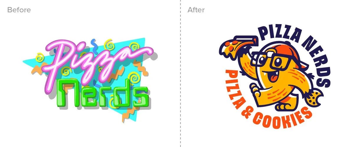
Pizza Nerds
“It's hard to emphasize how happy we are with Slagle Design. Jeremy spent a lot of time with us to get an understanding of who we are and what our business is about.
He educated us on the process and why certain ideas were better than others. He communicates extremely well. Lastly, the work always blew us away. He nailed everything he created.
Our rebrand is perfect and we're excited to continue working with Slagle.”
–Brent Gargasz, Owner
Inspired by 80’s and 90’s pop culture, Pizza Nerds is not your typical Detroit-style pizza shop. It’s a place where memories are made, vintage arcade games are played, and families and friends gather together to enjoy some of the best pizza in town.
From logo and branding to packaging, garments, interior mural, and exterior signage, this little independent pizza shop stands apart from the competition. Thank you to the owners, Brent and Katelyn, for trusting Slagle Design with their complete rebrand. It was a really fun project!
Silver Bridge Coffee Co.
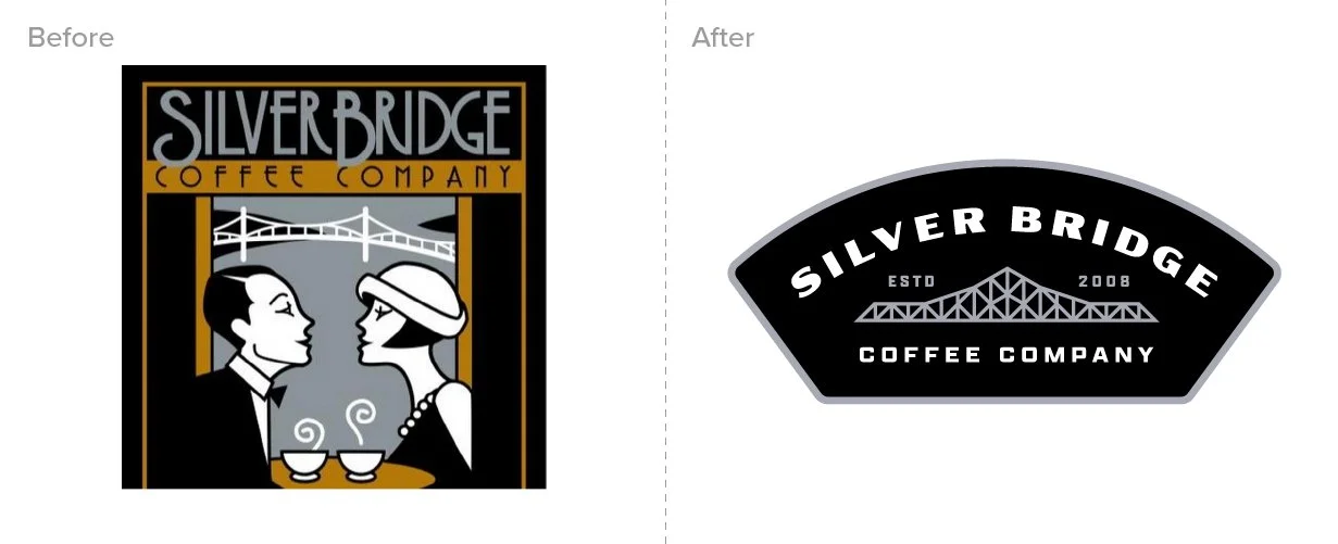
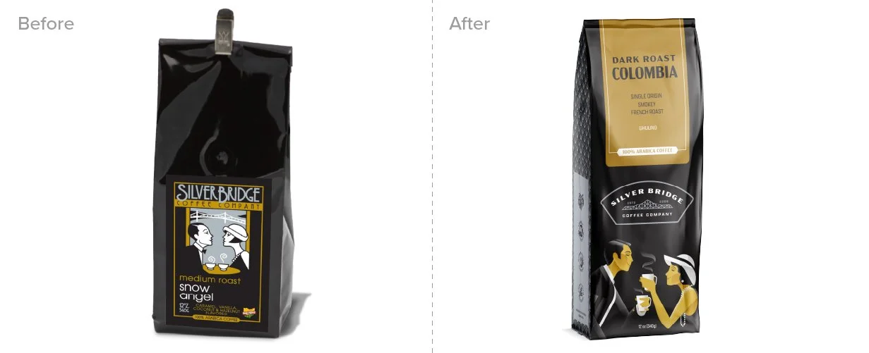
Silver Bridge Coffee Company reached out to work with us on an update of their brand identity and packaging. By separating the logo from the illustration of the couple on the front of their bag, we were able to give them a proper logo kit that is flexible, and easily reproducible. Their new brand is a big update while keeping the essence of the brand for their diehard fans.
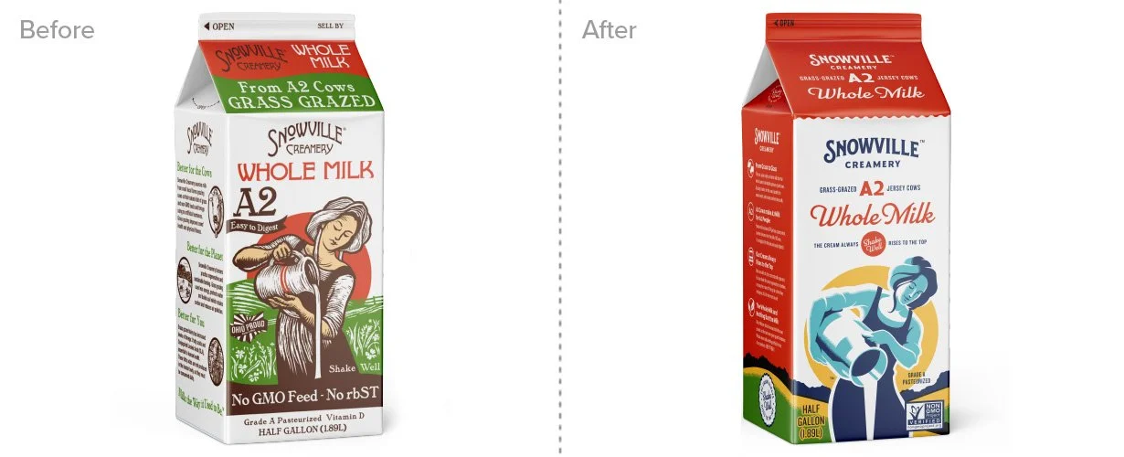
Snowville Creamery
“Working with Jeremy and Chris helped provide clarity for what we wanted to share with our customers, the experience was educational and enriching.
The final results leave us with our brand being shared with our customers in a way that validates our story and connects our hard work to our customers hearts.”
Anna Shields, General Manager, Snowville Creamery
Snowville Creamery is known throughout Ohio for their incredibly delicious grass-fed milk, yogurts, cheeses, and dairy products. They don’t just preach sustainability and the value of non-GMO dairy, they practice it. They have been a perfect match for the kind of clients Slagle Design dreams of partnering with.
It was important, from the start, to make a connection with their passionate customer-base, paying homage to the brand that got them to this point. In some ways this is a brand evolution and in others, it is a revolution.
As Snowville looks to the future, the possibilities and release of amazing new products, the new brand identity simplifies their visual branding and messaging and makes it easier to implement across a line of products. We are partnering with Snowville to redesign all of their packaging. It will slowly be appearing in grocery stores as they use up their existing package inventory–once more, a testament to their commitment to sustainability and stewardship.
Jerome Township
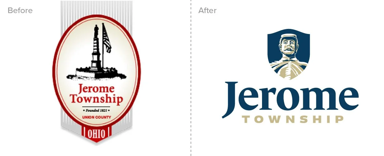
During the Civil War, 367 people from Jerome Township, Ohio joined the fight, which was a lot considering there were only 216 registered voters and a total population of 1,398. This included a few boys who were 16 years old and one who was 14. Sadly, 75 of those who enlisted lost their lives in the war. To honor their sacrifice, the township residents built a war memorial in New California that stands over 20 feet tall.
Their logo, however, was very difficult to reproduce at small sizes and inflexible when it needed to be used on a dark background.
As the township thrives and grows, there has become a need for a flexible brand identity system that could be used on everything from signage to vehicles to official documentation. Proud as ever for their sacrifice and prominently placed memorial statue, the decision was made to continue the tradition of keeping the statue as the focus of their identity but to create an updated, easier to implement brand identity.
Preservation Parks of Delaware Co.
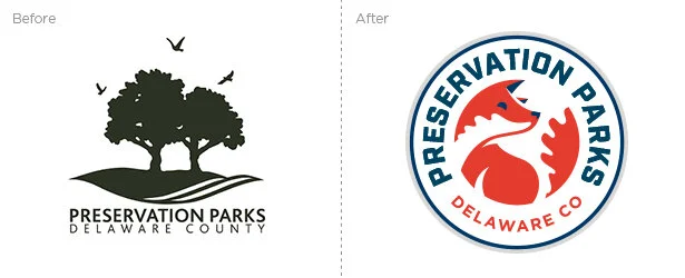
“We are excited to share our new logo. It will differentiate Preservation Parks in a county that is fortunate to be home to state parks, a popular Columbus Metro Park, and other local community parks. Each step in the process was done with intent and with the goal on being good stewards to our natural and financial resources.”
Tom Curtin, Executive Director,
Preservation Parks
The creation of the new logo was not only to differentiate Preservation Parks, but to continue to communicate Preservation Parks’ mission to Delaware County residents. “To protect and conserve the natural and historic features of Delaware County and to inspire outdoor exploration and learning.”
Olentangy River Brewing Co.

“Jeremy did a great job on our project! The outcome far exceeded our expectations. He was able to help us fine-tune our story and he created a design that was an extension of who we are.”
Bethany Schweitzer, Owner
Olentangy River Brewing Co. is first and foremost a welcome community space. A coffeehouse during the day that turns into a fantastic craft brewing and tasting room every evening, ORBC is THE place to be. Daily food trucks, Run Club, yoga classes, and gaming groups... there is always something happening.
This is the primary messaging behind their revised brand identity. If you look closely, the facets on the arrowhead are actually a map of their location along with the tributaries that run together to form the Olentangy River, symbolizing how they have carved their own path in the community as not only a great place for craft beer, but the place where the community comes to gather and celebrate life.
Eastland-Fairfield
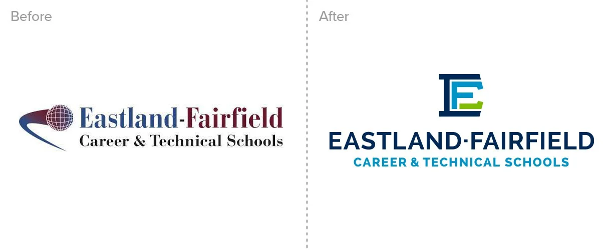
“We absolutely made the right decision in going with Slagle Design for our project. Jeremy was engaged, inquisitive, open-minded, and committed to making sure that we received what we expected and at the highest quality. His previous experience, engaged and enthusiastic demeanor, and overall skill served as a perfect match for our rebrand. It has been incredibly well-received by so many of our stakeholders. We could not be happier with where we are now, thanks to Slagle Design.”
Ryan Gasser, Coordinator of Communications and Marketing
Everett CC Trojans
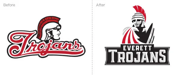
“Slagle Design was extremely easy to work with, and we could tell that he truly cared about getting our project right. They took the time to research and listen to community input, and worked diligently to meet our deadline with time to spare. Highly recommend.”
Garet Studer, Athletic Director, Everett Community College
College of Wooster Mascot
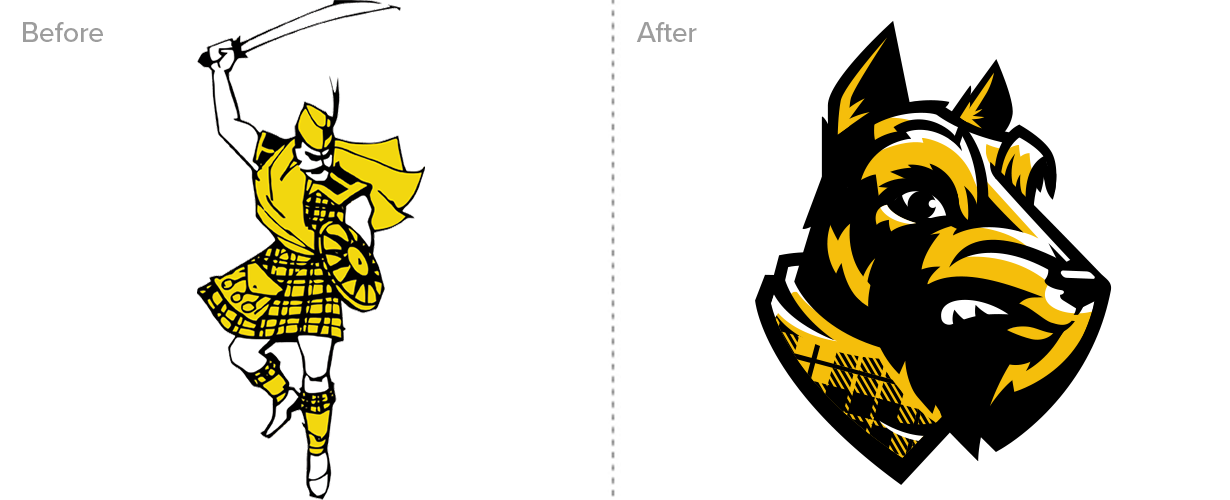
Slagle Design had the privilege of working with The College of Wooster to design their new mascot, Archie, the Fighting Scottie.
Their most recent mascot, a fighting Scotsman with a sword, was coming under some scrutiny. Students and faculty were concerned about the use of weaponry and pushed for a more inclusive, gender-neutral mascot that could be embraced more widely. Other issues plagued the old mascot. It was dated, overly detailed, and difficult to reproduce.
In response, The college reached back to its rich history to rediscover its original, traditional mascot, a Fighting Scottie.
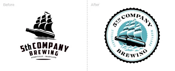
5th Company Brewing
“Jeremy has been amazing, his redesign of our logo was fantastic!”
Brandon Phillips, Partner, 5th Company Brewing
5th Company Brewing is a startup based in Perryville, Maryland, home of the United States’ first Navy, called the 5th Company. When the contacted us, they already had a logo. They liked the concept but we not thrilled with the execution and were looking for something classic, set in the right time period, and inspired by nautical themes related to their location and community.
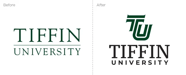
Tiffin University
“Thad and Jeremy were a pleasure to work with. Their respective talents provide a comprehensive marketing messaging approach and they are adaptable and flexible. They truly immerse themselves in their client’s organizational culture to find the messaging brand that most authentically represents that organization. I highly recommend them!”
Dr. Lillian Schumacher, President of Tiffin University
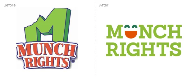
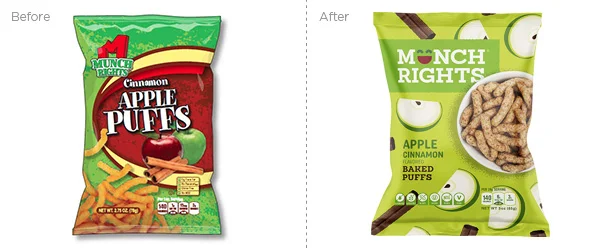
Munch Rights
“10 out of 10! Jeremy and his team are a pleasure to work with. They provide very quick responses on requests and have amazed us with their creativity.”
Lori Roberts, Customer Success Manager
Worthington Christian
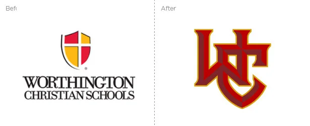
“We partnered with Slagle Design to update our brand identity. Our goals for the redesign included honoring our heritage while creating something that was not only fresh but ownable and specific to our organization. They hit a home run, and we couldn't be happier with the end product.”
Polly Schumacher, Director of Advancement
Cheryl’s Cookies
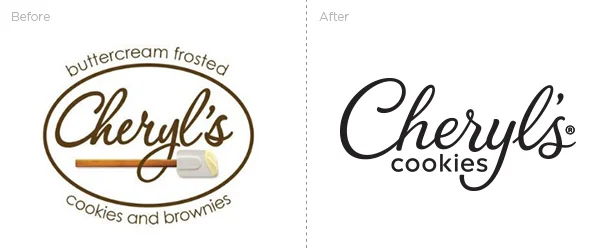
Cheryl’s Cookies contacted us to update the existing Cheryl’s script logo. The old logo was constructed from a “free font” that looked anything but custom. The letters didn’t connect properly, they were inconsistent and the overall logo had become so complicated that it really needed to be cleaned up and thoughtfully reconstructed. The goal was “evolution” and not a “revolution” as Cheryl’s plans to roll out the new logo over time as new products launch.
Yay Bikes!
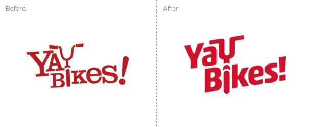
“Design for our rebranding and bike corral redesign.There’s no possible way they could successfully distill all of 'Us' into a simple visual design. Right? But this time? Sweet, sweet relief! They! got! it! They listened, and they translated what they heard into design elements more 'Us' than we knew possible.
Slagle Design gave Yay Bikes! a very rare, very special gift: a way to advance our mission through design that actually works to tell our story. We're so grateful for this process and its outcome!”
–Meredith Joy, Program Director, Yay Bikes!
DoverPhila Credit Union
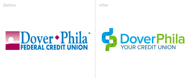
What started as a request for a simpler app icon, turned into a full rebrand for the organization which extended into website, signage, outdoor, print and radio advertising, and mascot development. The new brand is friendly and engages with their community as more than just a place to do their banking. They exist for the financial benefit of their members and to provide a level of service that meets their members’ financial needs.
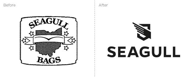
Seagull Bags
"We were faced with a very difficult challenge. We had to remake our entire image but have it line up with our existing product and reputation. I had thought that this was impossible, but after my first meeting with Jeremy I knew that he could do it. Jeremy was great to work with, and very creative. His proactive attitude was inspiring and helpful in getting the project done. The end result was miles beyond what I could have expected, and have received nothing but good reviews about it. It was probably the most beneficial investment I have made to date...that, and the hot tub full of champagne."
Daniel McKewen, Owner, Seagull Bags
"Make it epic." These were the words from Seagull Bags owner Daniel McKewen during our creative kick-off session. Seagull's bags are custom designed for bicycle messengers and bag enthusiasts alike who carry large heavy objects through urban traffic or for everyday commutes. They are designed to alleviate the weight, sit comfortably on your back, and help you get that package delivered in time.
Luna Burger
"We're really excited about the logo and packaging Jeremy and Chris designed for us. They updated our logo in a way that captured our message simply and legibly with an able and elegant hand. And the designs of our individual packages are even more stunning; they completely convey our message in a way that makes the brand and the product shine through the art."
Barbie Luna, Owner, Luna Burger
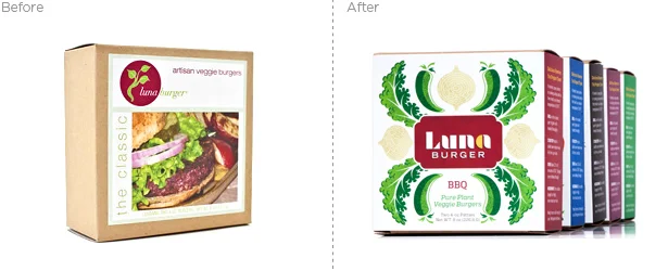
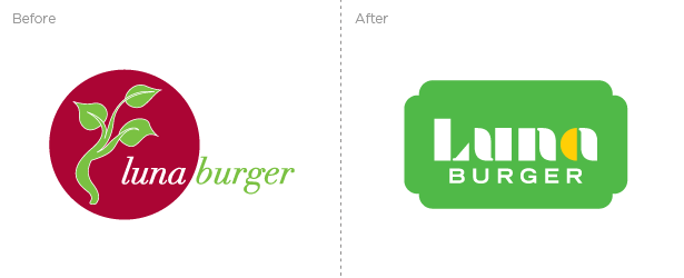
Megan and Barbie Luna are serious about plant-based foods. Vegan isn't just a way of eating, it's a way of living. It was essential that their new logo and packaging didn't mince words when it came to that fact. In our early meetings, they told us about the two things that they really wanted to keep from their existing logo: 1. They loved the plant and leaves, 2. They wanted to keep a moon shape. The burgundy red circle just wasn't saying "moon" to us so we made it even clearer. The final logo integrates the leaves in the letter forms and the half moon shows up in the "a" with it's own pop of color.
Brēzel
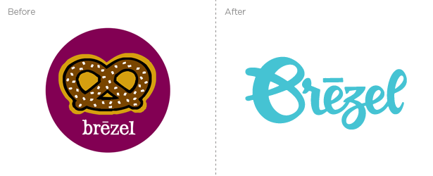
"Slagle Design transformed the look of our business from a start-up to a professional, established company with our personality and history shining through. I'm impressed by his work and so are our customers; we receive compliments all the time! Jeremy’s truly a genius at his craft!…
Since re-branding, moving to a new location and starting a retail line, our sales figures have increased pretty dramatically. We're quickly expanding, adding new team members and even looking for another space to continue to grow. Weekly, we are approached by potential wholesale customers that have heard about us or tried our product elsewhere. Word of mouth has been huge!
We've only received positive feedback regarding your work. Customers are noticing the details, right down to our aprons. Not only have customers said something about the brand & our space, but North Market management, other North Market merchants and even new hires have given us positive feedback.
–Brittany Baum, Owner, Brezel
Cedarville Yellow Jackets
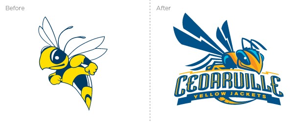
The Cedarville University Yellow Jackets have a time-honored athletic heritage whose teams routinely compete at a national level. As of the 2010-2011, the Yellow Jackets are moving up from NAIA to NCAA Div II, allowing them to compete at a higher level, bringing with it, more regional and national exposure.
The result was better than anticipated. After rounds of revisions and tweaks, working with feedback from the coaches, athletic director and communications department, a new mascot was born. Along with the mascot there are multiple custom type treatment and lockups. The new mascot can be easily reproduced from full-color to one-color applications. Go Jackets!