GRAPHIC DESIGN & ILLUSTRATION

Ritter Public Library
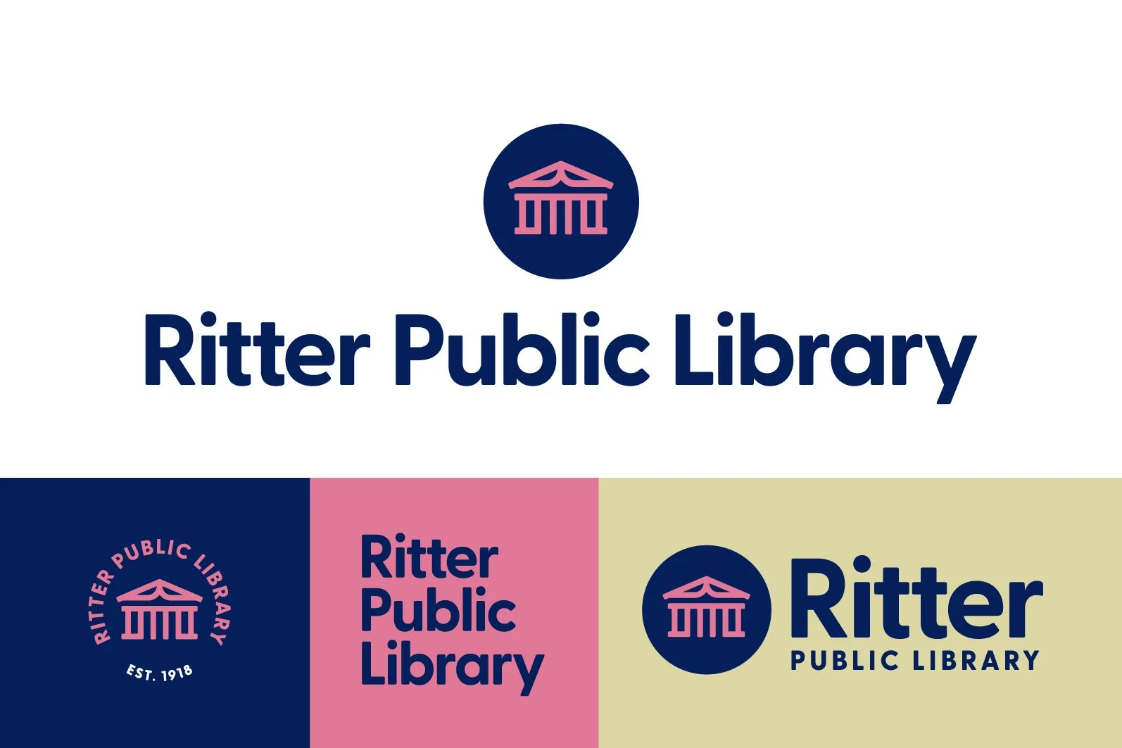
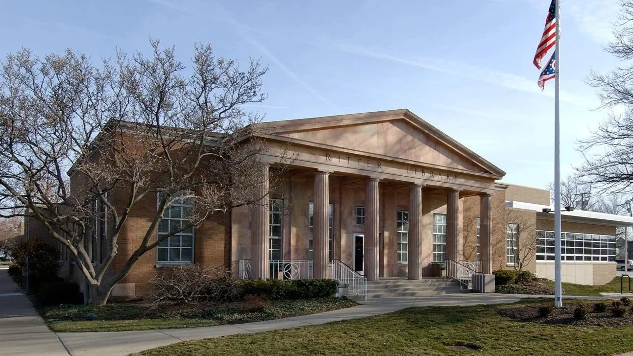
Slagle Design was commissioned to redesign the Ritter Public Library brand identity, drawing inspiration from its iconic pink marble federal style facade. The library’s existing logo, while visually appealing, was overly detailed, posing challenges in its use, particularly at smaller sizes.
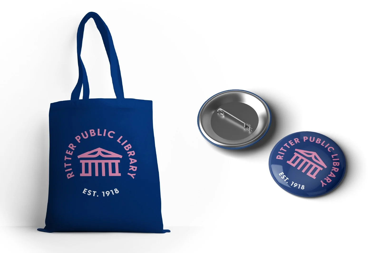
To address these issues, we simplified the logo by reducing its complexity to its fundamental shapes. An open book was incorporated to enhance the logo’s iconic nature, making it more adaptable and recognizable. This new design approach ensures easier application and improved visibility for the library.
“Jeremy was a joy to work with. He really managed to capture the unique qualities of our building and the community in the design. The community loves the new logo!”
Cheryl Grizzell, Director