New Work: Westwater Supply Rebrand


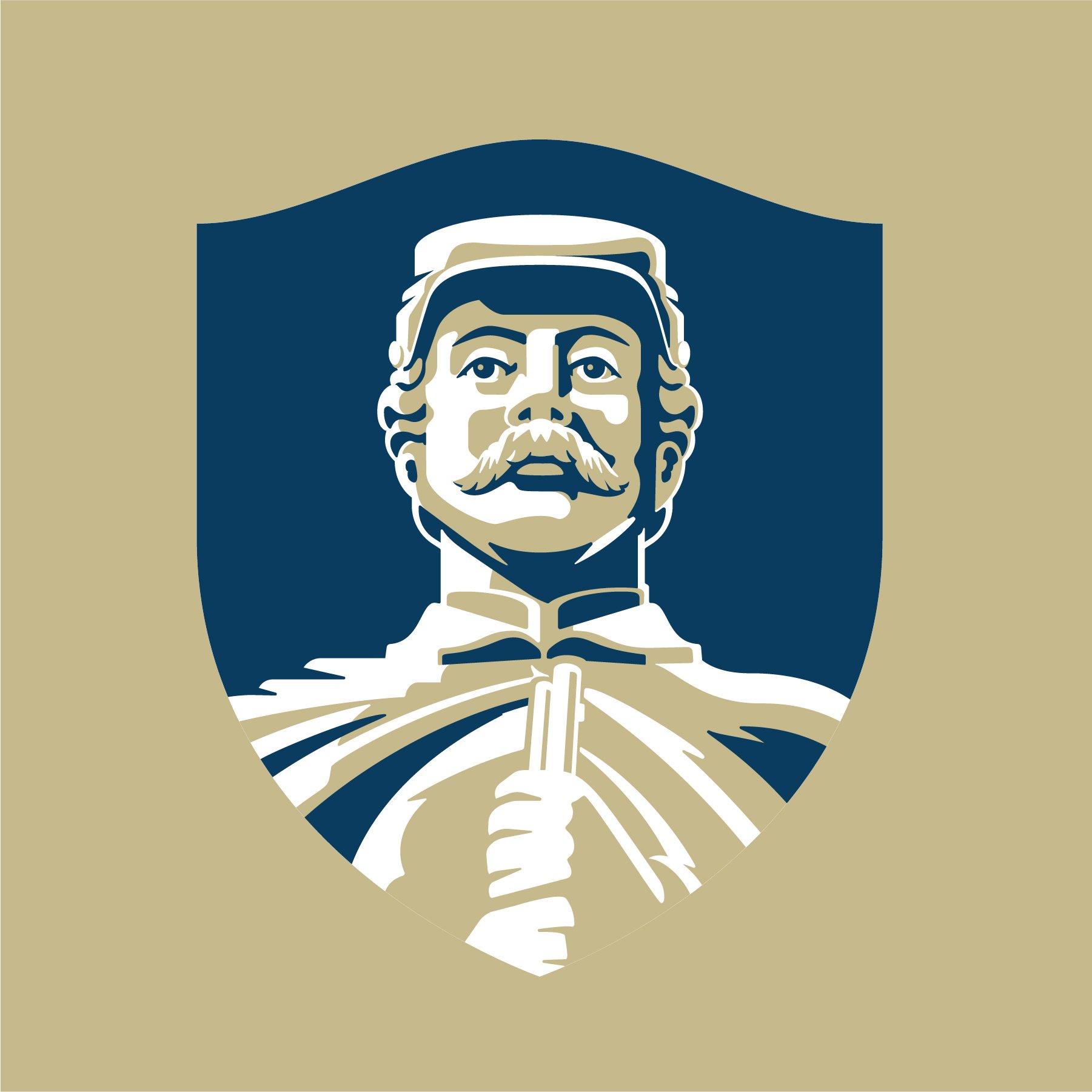
We are excited to share a rebrand for Westwater Supply, a company that has been serving Ohio since 1892. The updated logo and brand identity reflects their new messaging: SERVICE. ABOVE ALL ELSE. For over 130 years. It's the people that make the difference.


“Jeremy and his team did a terrific job. Initially, we spoke with several companies about cleaning up and updating our company logos to today's graphic and print standards. When we met with Jeremy, his interest in the history of our company and thoughts on our future were very sincere, which made Slagle Design the clear partner for our company. Jeremy helped us envision how our brand identity is conveyed by our logo, whether anything had changed over the years, and how our logo could capture our plans for the future. Through the process, we arrived at the decision to update our logo and were very pleased with the options created by Slagle Design. Since making the decision to change our logo, we've received great feedback from employees and customers, and are excited to roll out new building signage and vehicle graphics later this year.” Kirk Hendricks, CEO


Creative Partner: Thad DeVassie, Ratchet Strategy + Communication


New Work: Park Street Pizza Reboot


It’s not often you get a chance to rework a brand identity you helped create 10 years earlier.

The opportunities to with Park Street Pizza’s founders Rocky & Courtney Shanower on three of their restaurant concepts has been some of the biggest joys of my career. In 2023, the Shanowers celebrated the 20th anniversary of their original pizza restaurant and opening a much anticipated new location in North Canton, Ohio. It was 10 years ago that they reached oud out to Slagle Design to rebrand their restaurant and now seemed to be a good time to readdress some things and give the brand an updated and flexible look without a complete overhaul.

As much as I love the original logo, there were a few things I would change if I had the opportunity to to make some tweaks. When Rocky approached me to do a refresh, I was eager to jump in!

The original Park Street logo (2003) and the new (2023) logo

“Our company was challenged with a need for a total rebrand. We reached out to Jeremy. Not only did he accept the challenge but wholeheartedly embraced it. He created a breathtaking logo, vision and voice. Jeremy reincarnated our former selves into a vital, relevant brand with a vivacious heartbeat.”

—Rocky and Courtney Shanower, Owners, Park Street Pizza

Updates to the logo Slagle Design created on 10 years ago.

Refreshed color pallet and new secondary font selections pay homage to the original branding while giving them assets to use in social media menu and packaging.

Congratulations to the Shanowers and the entire Park Street Pizza family on 20 years of making the finest pizza in Ohio and creating spaces for the community to gather and celebrate with family and friends.


New Project: Hellbranch Cider Company


Slagle Design is excited to share the new brand identity and packaging we completed for Hellbranch Cider Company. James Wilson started Hellbranch as a hobby while working for a national insurance company. As with many of our clients, James’ hobby became an obsession, then a side-hustle, and eventually his full time job. We love helping entrepreneurs bring their passion to life!


It was a pleasure working with Jeremy. He was very patient and took lots of time to listen to my wants, needs, and preferences. He really got to understand my business and the plan for its future. I was blown away when I got the first look at the designs he created for me. I will definitely refer him to others and use his services again in the future. -James Wilson, Owner


We were able to start with what James brought to us. Most of the elements were there in the original logo. Through a process of in-person meetings at the cidery and field trips to local markets, we were able to better identify the most important aspects of their brand and create a logo and identity system that was more impactful, flexible, easy to implement, and visually spoke in their brand voice.