graphic design & ILLUSTRATION

In this engaging conversation, graphic designer Jeremy Slagle shares his journey in the design industry, discussing his unique approach to client relationships, the debate around retainers, and the importance of understanding client needs through immersive experiences. He emphasizes the significance of problem-solving in design and the necessity of clear communication to avoid bad client relationships. Slagle's insights provide valuable lessons for both aspiring and established designers. In this conversation, Jeremy Slagle shares his journey as an entrepreneur, emphasizing the importance of working with small business owners, maintaining low overhead, and understanding client needs. He discusses the value of unique branding, the process of gathering client reviews, and the role of SEO in attracting business. Jeremy also highlights the significance of personal projects in generating work and expresses his discomfort with traditional sales strategies. He advocates for a frugal lifestyle that allows for personal freedom and discusses his payment processes in freelancing. The conversation concludes with personal insights and where to find more about Jeremy's work.


It is open to all with a keen eye toward age-appropriate considerations for all readers. But Bookmark is more than a place where wisdom and ideas are housed – it is intended as a vibrant hall for group discussion, knowledge sharing, and meaningful civil exchange. We envision a space where homeschool programming can occur, ministries can convene, authors can visit and engage the community, and opportunities to advance the library’s mission can be met.

“Having known Jeremy for several years and admired his work, I knew I'd love the final product. However, I was not expecting the additional value Jeremy brought through his creative process. Not only did we get a clean, creative, and on-point brand for Bookmark, but we also grew in our own understanding of what we want Bookmark to be. Slagle Design is not money well spent, it's money invested well!”
David Baker, Founder


To keep with the overarching theme of “flight,” we were also commissioned to create an impressive 7 ft x 21 ft triptych that is installed prominently over the main kitchen. This artwork features a Green Heron, a bird that is native to Ohio and is often seen in the surrounding areas. The watercolor brush strokes and vibrant colors that bring the heron to life were also thoughtfully integrated into other elements, such as menus, coasters, matchboxes, and various other branded touch points throughout the restaurant.
“I’ve had the pleasure of working with Slagle Design to create a brand identity for our hospitality company and several of our restaurant locations. On each project, Jeremy and his partners engaged our team in insightful conversations listening closely to capture our vision, values, and goals. Each design package he delivered provided us with a visual identity that perfectly captured the essence of our brand and exceeded our expectations. Throughout the process, he and his partners were professional, communicative, and responsive to feedback, making the experience collaborative and enjoyable. I highly recommend Slagle Design to any business looking to elevate its brand and make a strong impact through thoughtful and effective design.”
Nancy Parrot, VP of Marketing


We extend our heartfelt gratitude to everyone who has placed their trust in us with their brand identities over the past 15 years. You have welcomed us into your factories, roasters, restaurants, campuses, and creative spaces. You have shared your journeys and allowed us to engage with your clients. Your commitment, hard work, and often personal investment demonstrate your dedication to creating meaningful work. Your efforts are vital to serving your community and enhancing the world around us. We are truly fortunate to collaborate with you. Entrusting us with your branding is a responsibility we hold in high regard.
Here’s to many more successful years ahead.
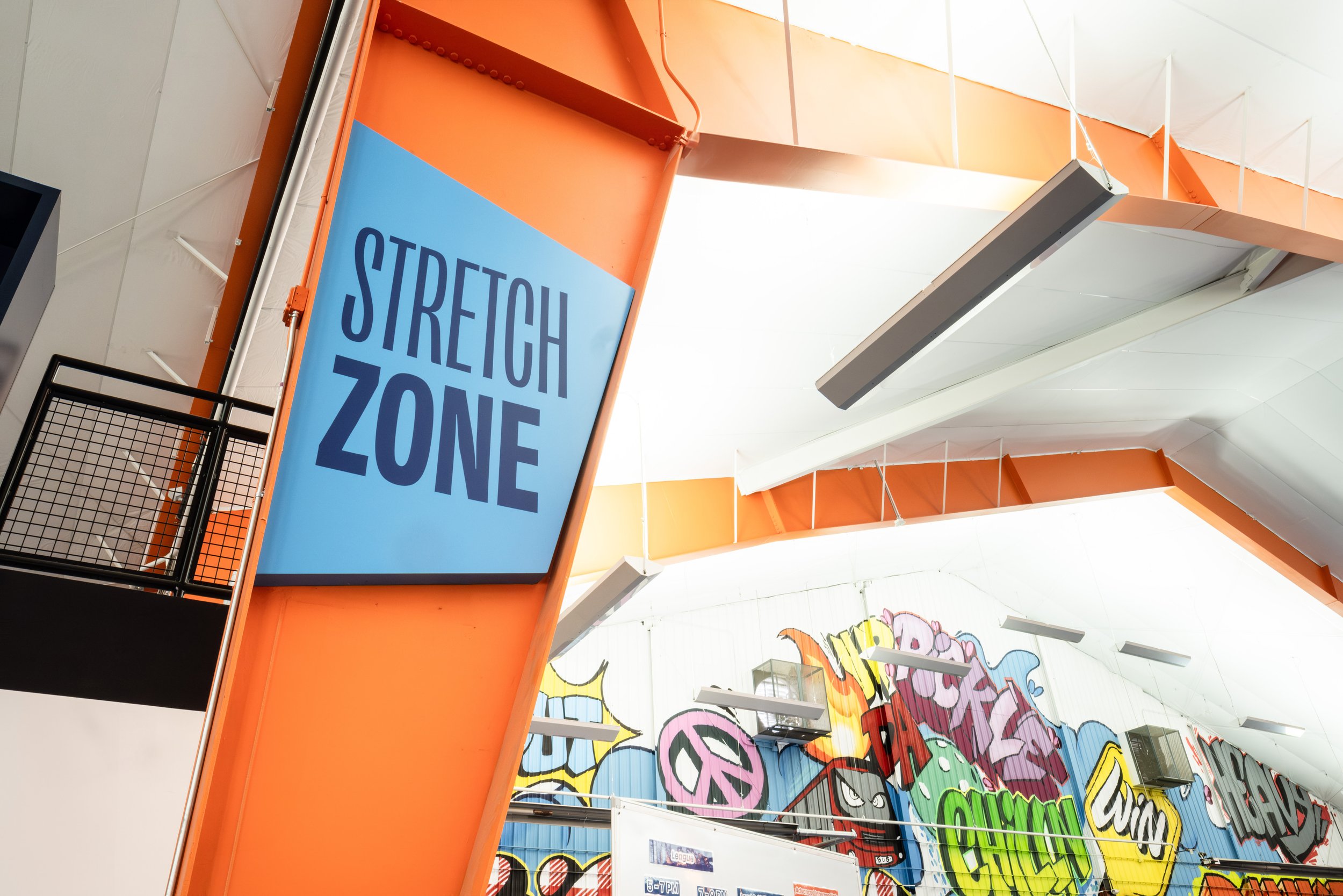
The project aimed to elevate the brand while staying true to their vibrant colors and overall fun aesthetic. As the former tennis facility rapidly expanded, it celebrated new partnerships with Ohio State University Medical Center, which highlighted the pressing need for improved way-finding and a more welcoming entryway.
We focused on designing clear signage that guides visitors effortlessly throughout the space, ensuring everyone can find their way to the various activities and amenities Pickle & Chill offers. Additionally, the entryway redesign emphasizes a warm, inviting atmosphere, making members and newcomers alike feel right at home. The blend of functionality and playfulness in our designs captures the energy of the club, enhancing the overall experience for all who visit.

While Slagle Design and team made it to the final round (top 2), we eventually lost the project to a super-talented agency whose work we admire.
None of this work has been seen outside of our creative team and the the small group of people working on the client side at OSU. We put a TON of work into this and we want to share our take on solving their unique problem…. even though we didn’t land the project.
I knew as soon as I got the call for this project, I needed to reach out to my buddy (and OSU Alum) Raf, one of the most talented guys I know. He jumped in and blew us all away with his amazing sketches. He definitely understood the assignment!


Concept sketches by Rafael Rosado
Working from Rafael’s sketches, we chose a few to design for the presentation. Brutus needed to look great in scarlet and gray but easily adapted to single-color options, all the while looking great on a t-shirt and other gear. We also reimagined him as an expressive set of emojis. The goal was to mix traditional university athletics style with a more expressive and versatile animation to present a more dynamic Brutus to the fans.


Greg Walter joined in to help bring Brutus to life and show the client the endless possibilities of creating a mascot that is more flexible and animated. He also cut a video together using the history and traditions of Ohio State athletics to our new concept.
My long-time friend (and OSU Alum) Thad, jumped in and listened well, took plenty of notes, dug deep into the OSU athletics history and came out with a gold mine of content. His content and clarity really brought the project to life and served as a map for the rest of us to follow as we worked from a deep well of OSU tradition and attempted to create the next evolution of the beloved mascot. You can download the entire presentation here.
More about Thad at www.ratchetstrategy.com

Click image to download the Presentation
Despite losing the project, we all learned a ton and had a blast working together on something we were all proud of. Thanks to Raf, Greg, and Thad for joining me on this crazy journey.
From interactive fan zones to music, games, autographs, free giveaways, MLS watch parties, and more, Soccer Celebration is the ultimate fan experience taking place in the leadup to the MLS All-Star Game presented by Target.
The community can take part in interactive activities and giveaways including customizing your own fanny pack with custom-made patches featuring our illustrations.

“Jeremy and his team did a terrific job. Initially, we spoke with several companies about cleaning up and updating our company logos to today's graphic and print standards. When we met with Jeremy, his interest in the history of our company and thoughts on our future were very sincere, which made Slagle Design the clear partner for our company. Jeremy helped us envision how our brand identity is conveyed by our logo, whether anything had changed over the years, and how our logo could capture our plans for the future. Through the process, we arrived at the decision to update our logo and were very pleased with the options created by Slagle Design. Since making the decision to change our logo, we've received great feedback from employees and customers, and are excited to roll out new building signage and vehicle graphics later this year.” Kirk Hendricks, CEO
Creative Partner: Thad DeVassie, Ratchet Strategy + Communication


Celebration of the new memorial, 1921

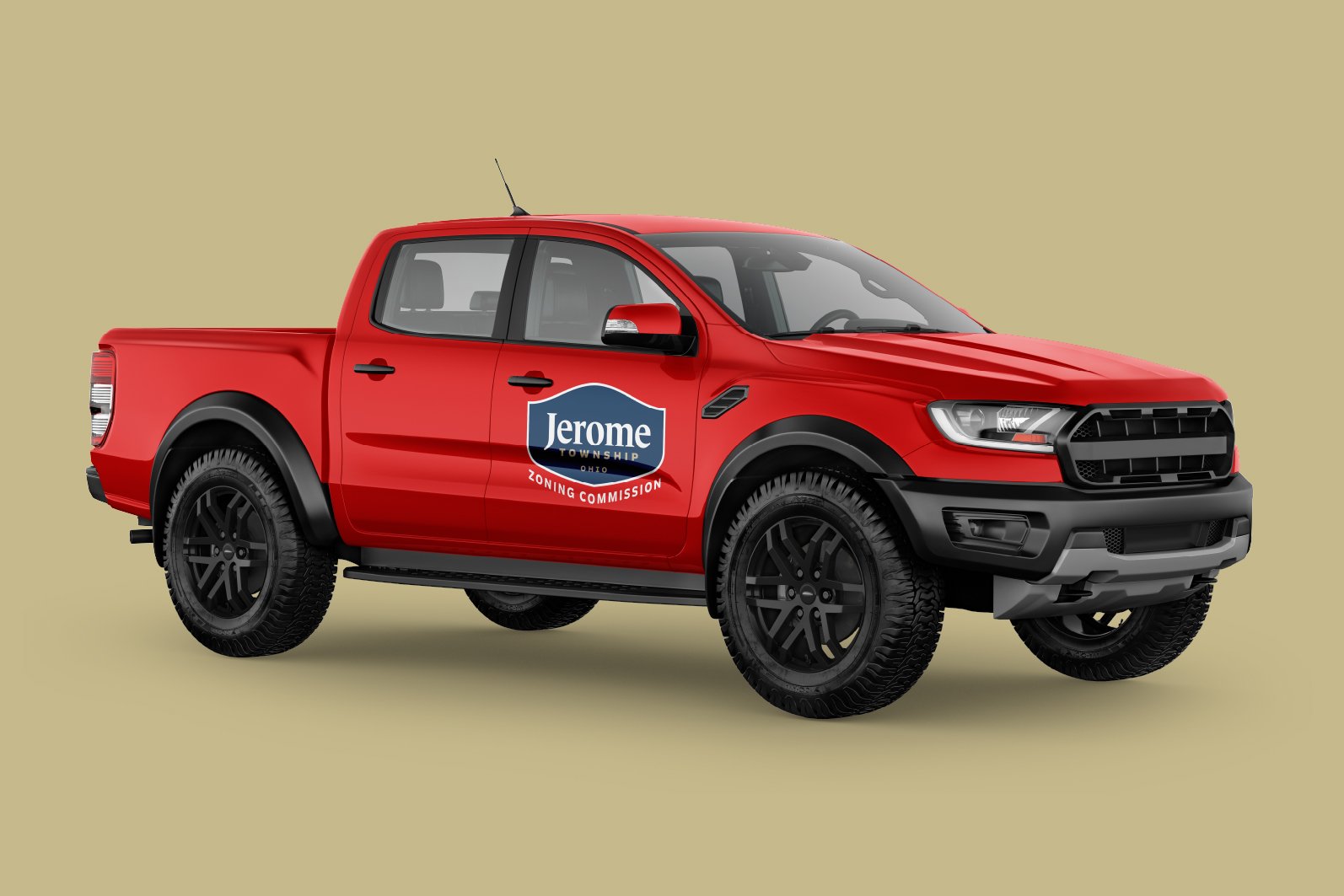
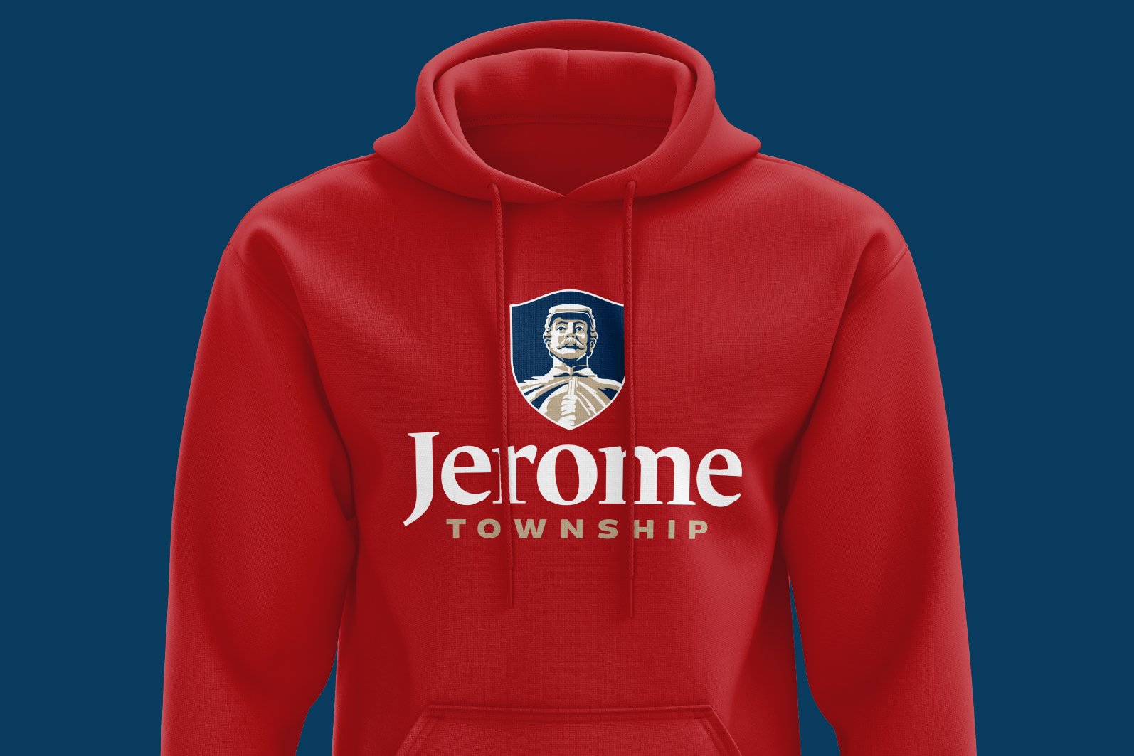
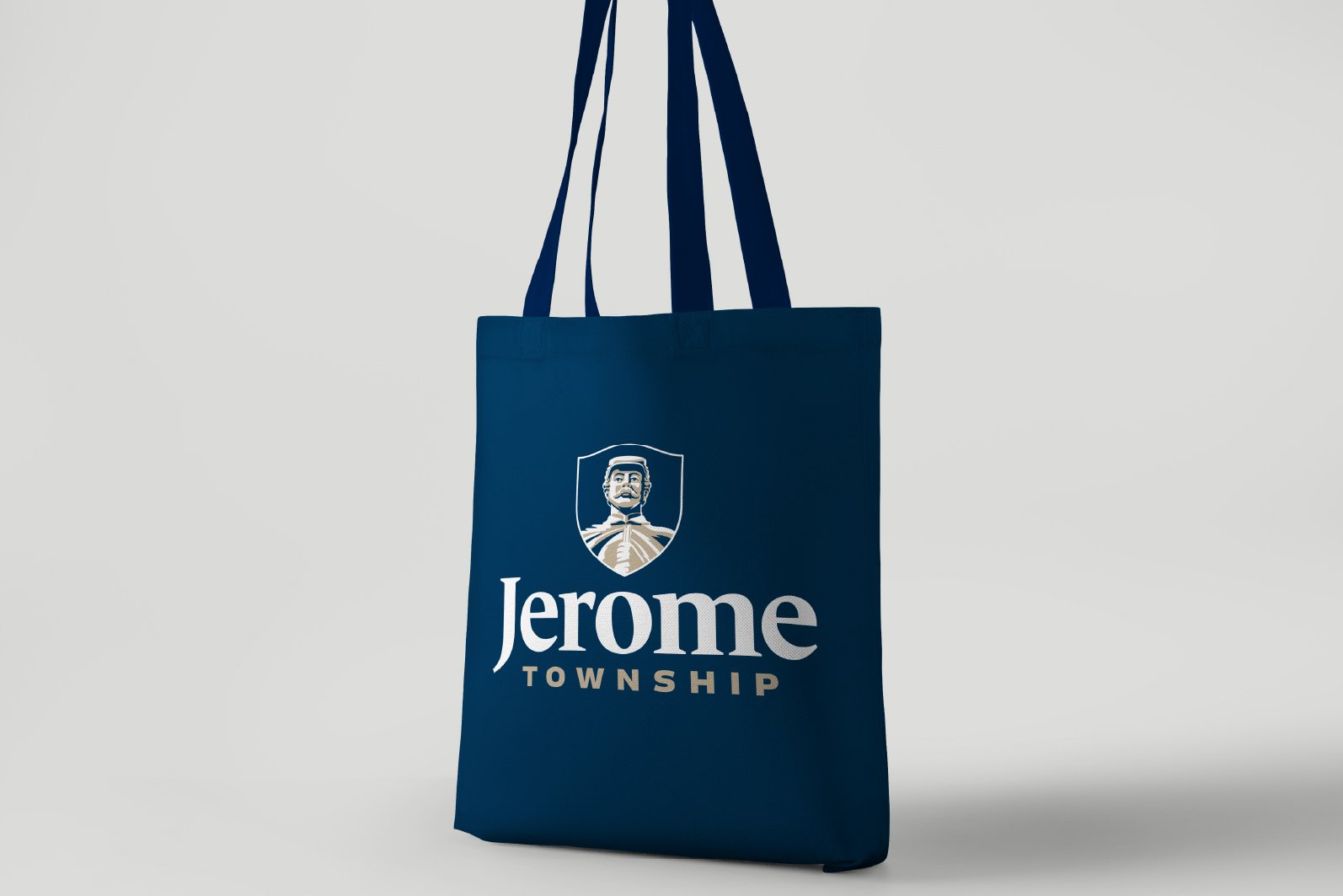
Proud of their heritage, Jerome Township has used the memorial prominently in their branding for decades.
As the township thrives and grows, there has become a need for a flexible brand identity system that could be used on everything from signage to vehicles to official documentation. Proud as ever for their sacrifice and prominently placed memorial statue, the decision was made to continue the tradition of keeping the statue as the focus of their identity but to create an updated, easier to implement brand identity.