

Slagle Design in partnership with Ratchet Strategy + Communication worked with Yay Bikes! to revitalize their well-recognized and beloved brand.
Our mission was to raise the profile and presentation of the Yay Bikes! bike corral – as well as provide the community and users of the bike corral with relevant information that compels them to new or increased levels of engagement with Yay Bikes!
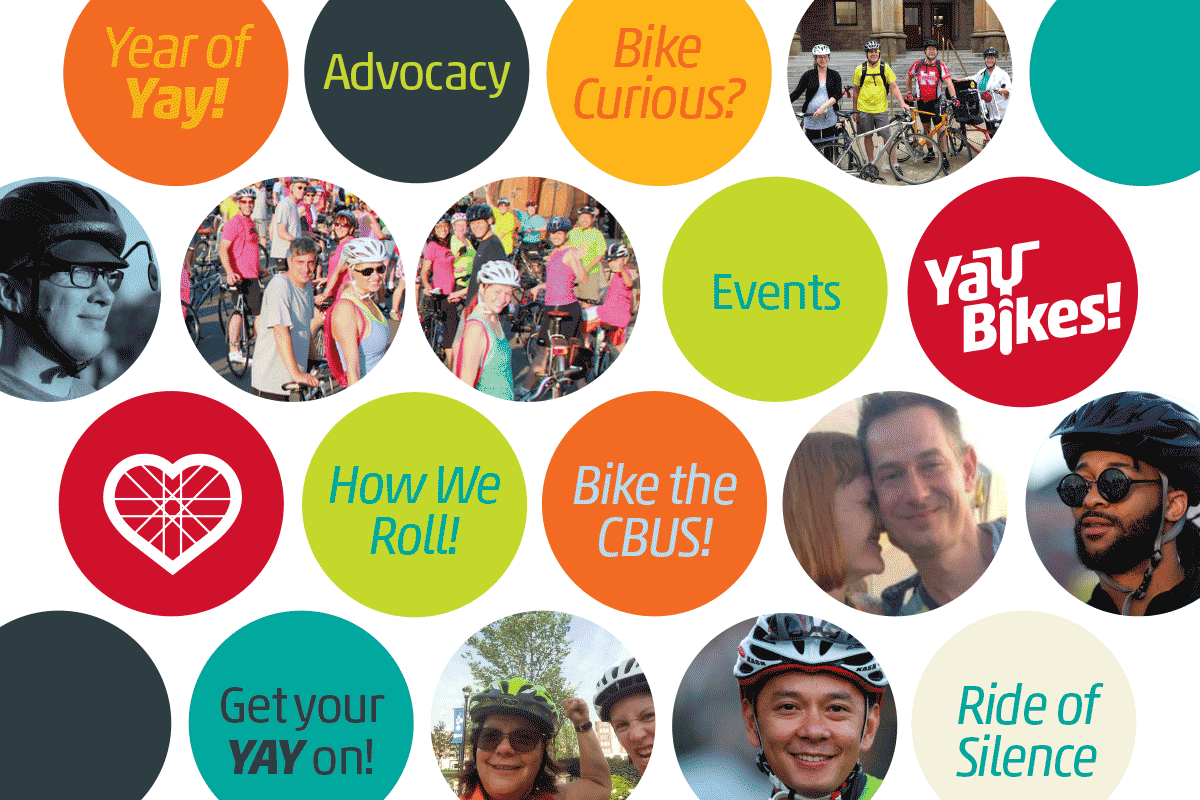
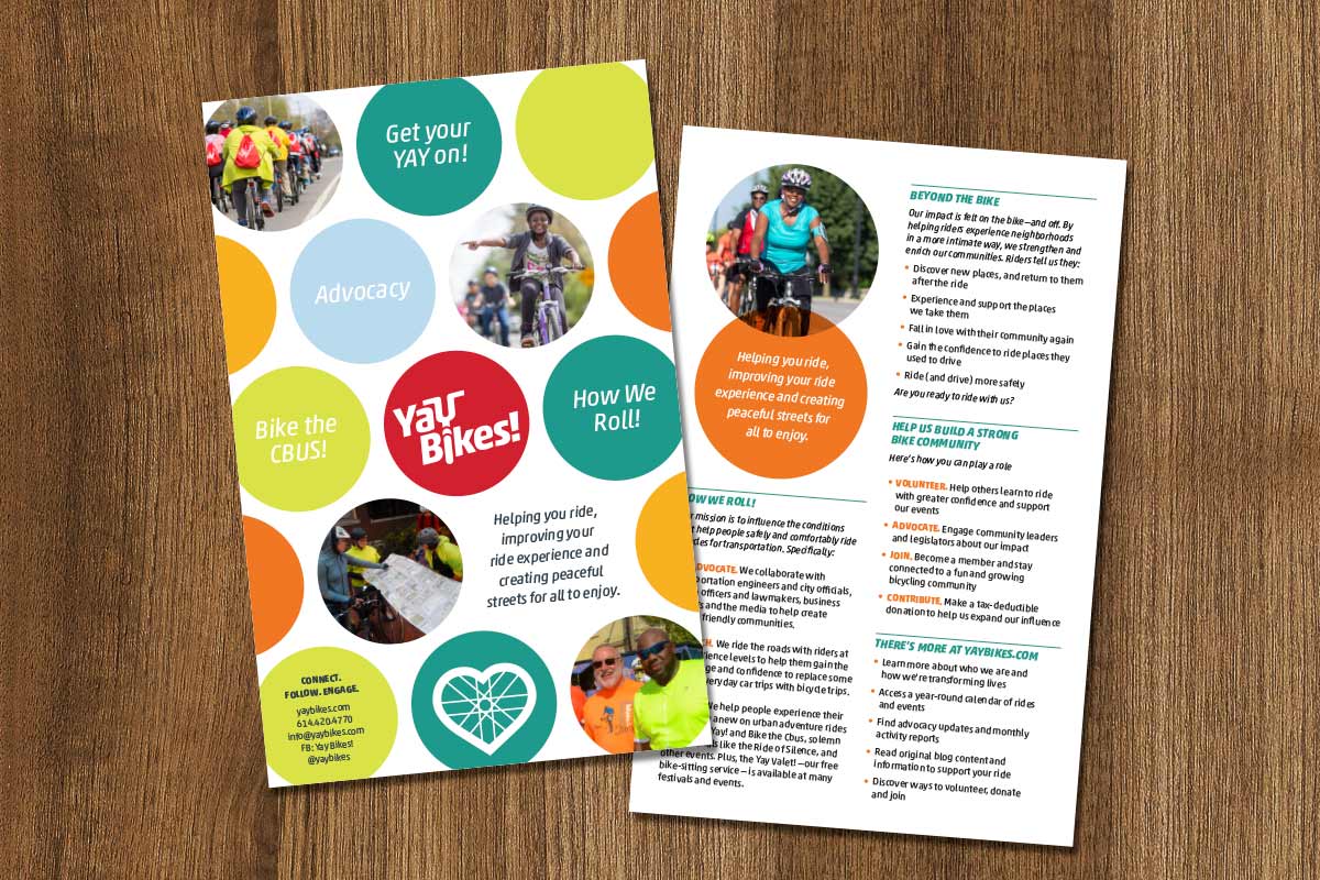
Over the years Yay Bikes! created several events and educational opportunities, each with their own name and unique logo. This has lead to a lot of confusion. Through our meetings and conversations to address the bike corral and articulate the Yay Bikes! multi-faceted story, we recognized an an opportunity to do more than simply deliver these specific deliverables. We recognized the potential in a cohesive and consistent brand identity.
By looking across all of the organization’s activities, we saw the potential in enhancing the brand in ways that would help it better fulfill its mission and engage its target audiences, elevating the Yay Bikes! brand to its proper position as the organization that truly represents the educational, event-driven, advocates of bicycle fun, safety and transportation in Central Ohio.
A refined brandmark
The existing Yay Bikes! brand was well-recognized and the concept was solid. No need to reinvent the wheel. However, as the organization is increasingly involved in advocacy, working with local law enforcement on safely initiatives and local government on policy issues, it was apparent that the brand needed to be able to appeal to a more diverse audience, allowing them to be taken seriously by city engineers, officials and legislators while not losing the fun of their community rides and educational events.

The new logo appeals to a more diverse audience, allowing them to be taken seriously by officials and legislators while not losing the fun of their community rides and educational events.
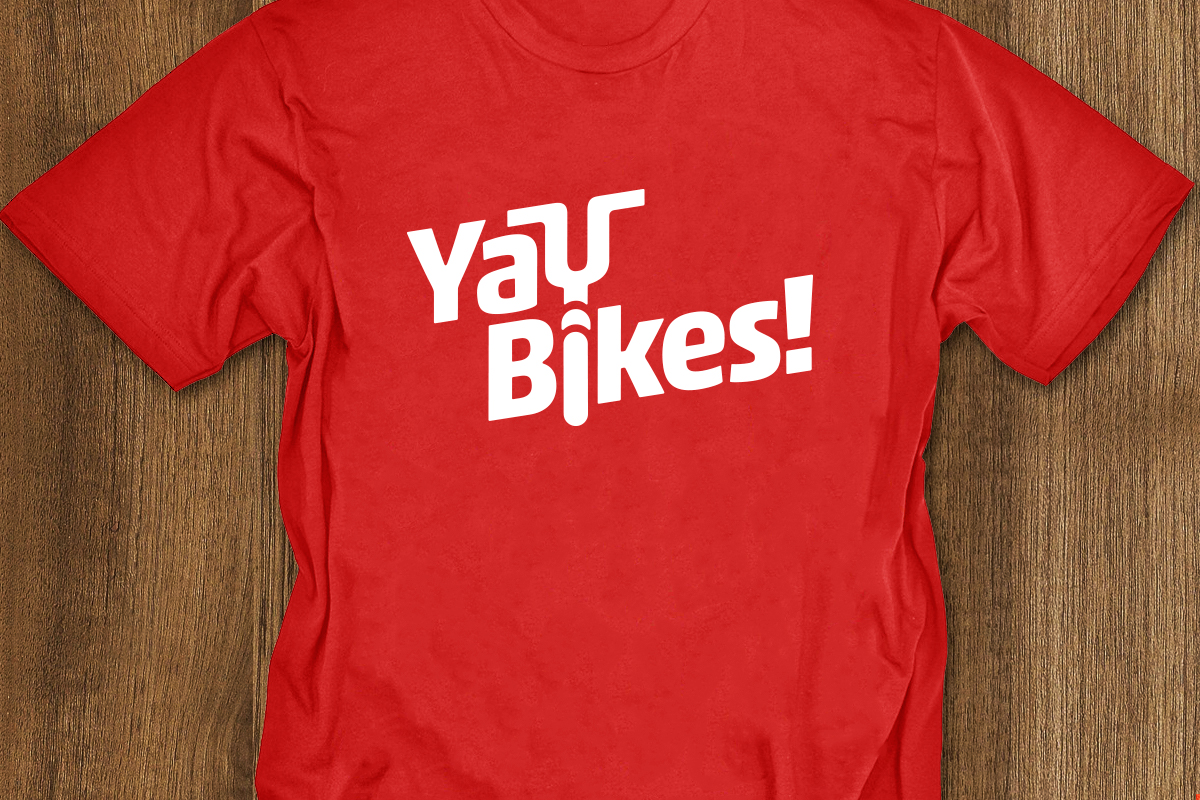
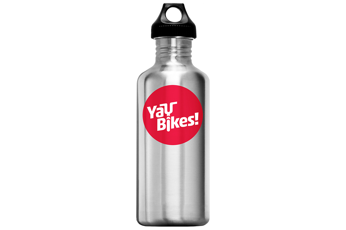
By building upon the success of their existing logo but standardizing the font, spacing, angle, and line width we were able to better bridge the audience gap while making it easier to read at a distance as well as at small sizes.

The new Yay Bikes! logo is streamlined, allowing it to be read more legibly at smaller sizes.
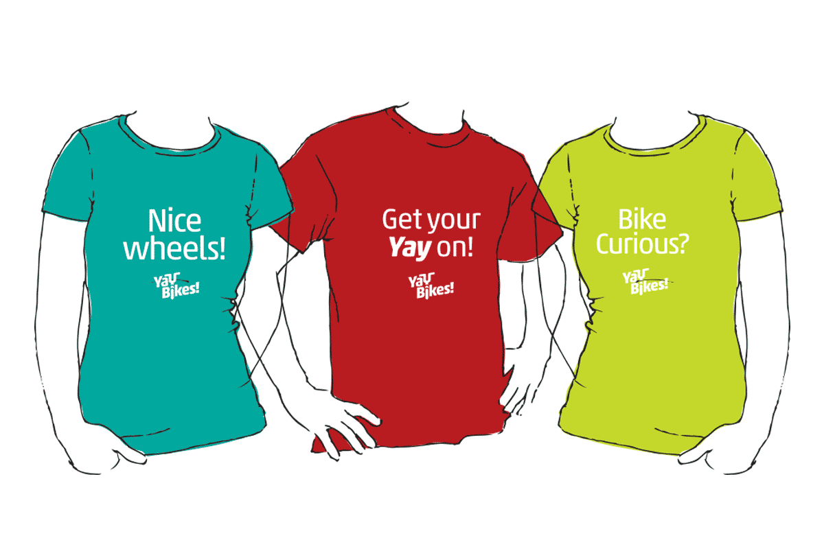
Brand consistency
To elevate the Yay Bikes! brand, we also created a standard for the various sub brands and renamed the “Pedal Instead Bike Corral” to “Yay Valet!” further reinforcing the ties to the Yay Bikes! brand.

The sub brands were diluting the strength of the core brand and it became apparent that most people didn't realize they were related.
“It always feels risky to entrust your identity to a design team, and so it was for Yay Bikes! to engage Slagle Design for our rebranding and bike corral redesign.
There’s no possible way they could successfully distill all of 'Us' into a simple visual design. Right? But this time? Sweet, sweet relief! They! got! it! They listened, and they translated what they heard into design elements more 'Us' than we knew possible.
Slagle Design and Ratchet Strategy gave Yay Bikes! a very rare, very special gift: a way to advance our mission through design that actually works to tell our story. We're so grateful for this process and its outcome!”
—Meredith Joy, Program Director, Yay Bikes!